


本計画は、22年前に施工された既存内装を一新し、現代のニーズに即した居心地の良い空間へと刷新することを目的としている。 顧客の滞在体験を高め、店舗としての魅力を再定義することで、今後の持続的な運営に資する改修を目指した。
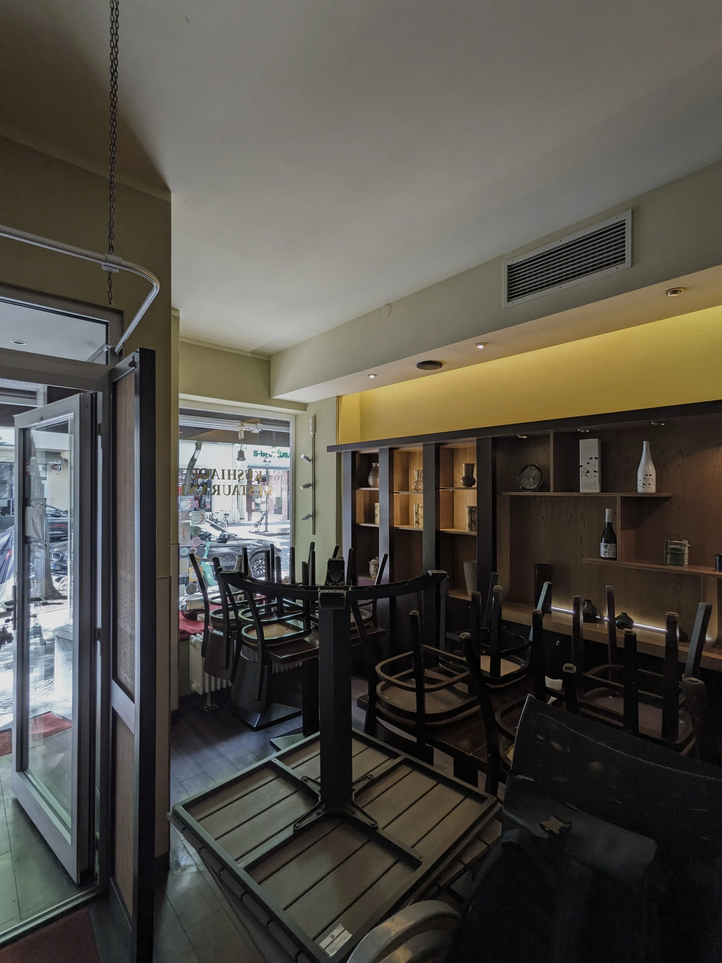
第一の課題は、空間レイアウトの再編である。 現状、店舗正面の客席エリアはドリンク提供や収納用途によって圧迫されており、本来確保すべきテーブル席数十分に得られていない。特に、実際の顧客の多くはカウンター席よりもテーブル席を望む傾向が強く、この点は優先課題と捉えた。よって、ドリンクコーナーをバックヤードへと再配置し、表の空間を最大限に活用するレイアウトとした。
第二に、空間の質においては、ファーストフード的な開放感や明るさではなく、「串乃屋」という店を目指して訪れる顧客に相応しい、落ち着きと品位のある空間づくりを志向した。客単価の水準も踏まえ、空間にはある種の重みと特別感が求められた。 そのため、計画ではコスト配分を正面の客席空間に集中させ、汎用的な素材ではなく、自然素材の持つ質感と存在感を活かす設えとした。具体的には、テーブルや化粧材には無垢のナラ材、壁面を大きく構成するベンチ背面には焼杉、エントランスまわりには玄武岩を用いるなど、和の空間に通底する素材選びを意識しつつ、全体のバランスを丁寧に調整している。
また、意匠的には伝統的な「和風建築」の文脈を避けながらも、和食に相応しい空間性をもたせるため、「和装」のイメージを空間構成の鍵とした。反物が水平に連なり空間を囲むように、各素材が横方向に展開し、重なり合う構成とすることで、和装の重ねのような温かみと奥行きを表現している。空間作法においては、重心を低く保つことを大切にしている。
特にドイツにおいては1階空間の天井高が平均3m近くあるため、実際の高さを下げることは難しいが、2100mmの高さに水平ラインを設け、空間を上下に切り分けることで、視覚的な落ち着きを与え、着座時に重心の低い居心地の良い空間が感じられるよう配慮している。
照明計画も全面的に見直し、照度および光束を抑えることで、過度な明るさを避け、テーブル上や会話に自然と意識が向かうような環境をつくり出している。
This project aims to revitalise an interior completed 22 years ago, transforming it into a comfortable environment that aligns with contemporary expectations. By enhancing the customer experience and redefining the venue’s spatial character, the renovation seeks to support the restaurant’s long-term, sustainable operation.
The first challenge was the reorganisation of the layout. In the existing condition, the front dining area was constrained by drink service equipment and storage, resulting in an insufficient number of table seats—despite the fact that most guests clearly prefer table seating over counter seating. To address this, the drink station has been relocated to the back-of-house, allowing the primary public area to be used to its fullest extent.
The second focus was on spatial quality. Instead of pursuing the openness and brightness typically associated with fast-casual dining, the intention was to create a calm and dignified atmosphere suited to guests who visit Kushinoya with purpose. Given the restaurant’s price range, a sense of substance and understated exclusivity was essential. Accordingly, the design concentrates the budget on the front seating area and avoids generic materials in favour of natural ones with authentic texture and presence. Solid oak is used for the tables and finish surfaces; charred cedar defines the large bench-back wall; and basalt marks the entrance zone—choices that subtly reference Japanese material sensibilities while maintaining careful balance throughout.
In terms of expression, the design avoids overtly traditional “Japanese-style architecture” yet still conveys an atmosphere appropriate for Japanese cuisine. The conceptual key lies in the notion of washō (Japanese attire). Just as layers of fabric extend horizontally around the body, the materials in the space unfold laterally, overlapping to create warmth and depth reminiscent of layered kimono textiles.
A low visual centre of gravity is also fundamental to the spatial composition. In Germany, ground-floor spaces typically have ceiling heights close to three metres, making it difficult to physically reduce the height. Instead, a continuous horizontal line is established at 2100 mm, dividing the upper and lower zones to impart visual calm and ensure that, when seated, guests feel a grounded sense of comfort.
The lighting plan was completely rethought as well. By intentionally reducing lux and lumens, the space avoids excessive brightness, encouraging attention to naturally settle on the table and on conversation.
Kushinoya
Location: Berlin, Germany Status: Completed Area: 100㎡ Program: Restaurant Date: 2025 Photo: David Frank